
photo cred : {irving penn via doowop}
photo cred : {irving penn via doowop}

Happy 1st day of spring! I’m so excited that it’s is finally here! I took Bailie on a walk this past weekend (believe me – that barely ever happens with my lazy pup) and I couldn’t help but notice all the flowers popping up all over our neighborhood. They are such a friendly & joyous reminder that warm weather is on its way too!
These antique botanical illustrations are so so pretty and I just love the intricacy and detail of them. I’m really tempted to nab one of these to hang somewhere in our home. Wouldn’t they be perfect mixed among a gallery wall? I think the ones in the 1st row are my favorites.
illustration cred: {via panteek}
Why is it that I always wait until the last minute to figure out something to wear for Valentine’s Day? Red? Pink? Just a little pop of color? Hmm. What to wear this year…what. to. wear?!
I’ve rounded up a few must have accessories and gift ideas for this year’s LOVEfest. How are you celebrating the day of love? Dinner? Low-key movie? Trip away? Night out with friends? The possibilities are endless!
 photo cred: lips {via i heart makeup art} bag {marc by marc jacobs via net-a-porter} valentine accordion {the craft dept martha stewart} lace plunge {mimi holliday by damaris via net-a-porter} sequin hearts {ban.do} pink bamboo utensils {core bamboo via fab.com} xo earrings {cocodot} cupcake {georgetown cupcake} greeting card {rifle paper co.} off pitcher + cup {branch home}
noun. an arrangement of flowers, leaves, or stems fastened in a ring and used for decoration OR a perfectly suitable floral option for celebrating the day.

wreaths aren’t only for the holidays.
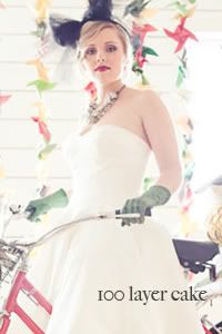
photo cred: 1 {the nichols via style me pretty} 2 {caught the light via 100 Layer Cake} 3, 4, 6 {via wedding chicks} 5 {nancy neil via once wed}
Filed under Bow Tie & Bustle, Bride & Groom, Defined, Details, Florals, Scout Vintage Rental Company, Weddings

It’s always the best feeling in the world when a design you’ve spent many months tossing and turning about in your mind finally comes to life! Last month, I had the immense pleasure of collaborating with Trophy Cupcakes and showcased my scout. vintage rental co. collection in their adorable party room. The whole evening was SUCH a blast and I was so excited that so many of you came out to see my loot!
When dreaming up a way to share my collection my 1st thought was: “oh my gosh, how will I ever make it all fit?!” and 2nd…”I want people to be inspired.” The whole intention behind my vintage rental biz is to encourage others to find beauty in things that might otherwise be considered past their expiration date. I absolutely adore repurposing old items into new designs, and threaded that passion into a lot of the party details for the launch.


I wanted the overall design to emphasize the immense amount of color that I have within my collection. Blue chairs, green tables, orange enamel colanders. I’m obsessed with color and the party was nothing short of a color explosion!
My dear sweet friend McKenzie who also happens to be one of the most AH-MAZ-ING floral designers in Seattle, was kind enough to offer her own dose of color to the party with some stunningly gorgeous florals. The second McKenzie arrived the morning of setup I was flabbergasted by her floral choices for the party. Are those gigantic neon pink peonies not the most amazing things you’ve ever seen?! So so good. Thank McKenzie!!!

The entire design for the room started with the ceiling. I’ve been collecting vintage fabric for sometime and I really wanted to create a vibrant fabric canopy over the party. After many tireless hours of knot tying the canopy came to life. I also incorporated an installation in the center of the room using the wire skeletons of old lampshades. Thank you Adam, Heather & Kate for your additional hands with setup & prep! Couldn’t have done it without ya!


My green hutch is definitely one of my favorite pieces and I was so excited to use it as one of the focal points of the room. The cocktail & cupcake party wouldn’t have been complete without some champagne and little mason jars & thanks to Hads, Emma & Christa everyone had drinks in hand through the night! Thanks gals!

One of the things that I was really adamant about with regards to my scout. marketing is that I didn’t lose the vintage aspect of the brand in the details. I cringed at the idea of using a modern looking business card to promote my business. So after a bit of deep thinking I came up with the idea of using vintage used postcards (some of the one’s I’ve found have dated back to the early 1900’s!) and placing a sticker on top of them with all my info.
I have this really crazy rad mint colored mattress frame that worked perfect for displaying my biz postcards during the event. I filled the mattress with a bunch of pillows I’ve found while scouting and a few I made on my own from leftover fabric.


I also really wanted the party to be a direct reflection of the personality of the pieces. I’d been dying to name each piece for sometime and figured the party was the perfect way to kind of say “hello my name is” for each unique piece. My buddy Amy (a stellar graphic designer who is currently revamping the scout. brand) suggested I use library cards in bright colors from the adorable paper co. Knot & Bow to display the names and details of my items. GENIUS! I was swooning over the library cards when they arrived in the mail, and after multiple attempts to get that “vintage typewriter” look (I actually begged my printer to cooperate during a 4am debacle) I was incredibly pleased with how they turned out!


Overall, I’m ecstatic with how the party turned out, and I was so grateful for the generosity of all of the people that stopped by. The party left me with visions of my own storefront one day, and I can’t thank Jennifer and her team at Trophy enough for all of their help in making the party a total success!!!


P.S. Thank’s to Mo for all the great shots and for being there to capture the night!
photo cred: {Mo Hines Photography}
Filed under Antique Rentals Seattle, Antiques, Art, Bow Tie & Bustle, Brights, Business, Centerpieces, Color Obsessed, Color Palette, Decor, Decorating, Design, Fabric, Florals, Inspirations, Local Happenings, Parties, Party, Prop Rentals, Props, Recycle, Repurposed, Scout Vintage Rental Company, Scout Vintage Rentals, Scout., Seattle Event Design, Seattle Prop Rentals, Seattle Vintage Rentals, Seattle Wedding Coordinator, Seattle Wedding Design, Seattle Wedding Designer, Seattle Wedding Planner, Tabletop, Vintage, Vintage Finds, Vintage Rentals, Wedding Event, Weddings
With only a little over a week to go until my sister’s anticipated delivery of baby Emryk I am over the moon excited with anticipation. As the days have ticked closer and closer, and as Sarah’s belly has grown bigger and bigger, the realization that my sister is about to embark on this grand new adventure in her life is becoming all the more apparent. And it is SUPER exciting!
Back in August I had the total pleasure of co-hosting her baby shower (although we called it a baby party) along with my Ma and little sis Coli and it was SO much fun! I was given full creative liberty which felt nothing less than AWESOME, and was totally stoked to really see where the zoo animal theme could go. The whole design was inspired by these adorable cardboard cutout zoo animals my Mom stumbled upon during her last visit to Seattle, as well as an animal invite I had fallen in love with from my favorite paper company: rifle. Lucky enough for us Sarah was also decorating her nursing in cuddly animal prints so the theme just made total sense. I wanted the party to be personalized and unique but most of all I wanted my sister to feel loved and adored.


I envisioned the use of a bright primary color palette (think red, blue, yellow, green) and intermixed unique and whimsically textured florals as well as little paper details for unexpected pop’s of color. I was so excited about the possibility of doing not just the paper details and decor but also to dip my hands into the floral aspect of the event as well. Let’s just say I loved EVERY second of it. It was one of those designs and weekends that just made me feel totally alive and bubbly with excitement! It was MOST exciting to see the total shock and awe on my sister’s face when she walked into the party. B-E-S-T feeling in the world to have your “client” thrilled with your design!

I used milk glass, as well as eclectic jars and bottles from my scout. vintage collection to sporadically place cheery florals around the party. I wrapped the eclectic vases in varying colors of yarn for added texture and a little extra whimsy. I continued the zoo animal theme onto the paper details by labeling each “station” or table with a different animal….i.e. “w is for walrus, w is for wishes” or “g is for gorilla, g is for grub” for the entrance and food tables.


One of the little details I was most excited about was the cake push pops. I’d found these super rad containers through the adorable party supply company shop sweet lulu. Aren’t they fun?!
We baked some confetti cake, punched out the cake in circles to fit down in the containers, and then squeezed in yummy icing to the containers. Finished ’em off with some sprinkles and voila! SUPER EASY!
I did have to get a little creative to get the little suckers to stand up, but with a little floral foam and one of my antique pepsi crates from scout. they were a HUGE success at the party. Everyone was so delighted by them! The kiddos were gobbling them up!

With sewing help from my ma (I have never been a wiz with the sewing machine) we hand-crafted little favor bags and attached thank you tags to them. I placed them atop the antique high chair that has been passed down for generations in our family for that extra special touch.

I loved the idea of decorating both the inside and outside areas of the party with paper chains. I stocked up on tons of bright colorful patterned paper, as well as a bunch of solid sheets and got cutting. A bazillion hours later I had NO clue how many pieces I had actually cut, but we ended up having enough chains to decorate the entire dining area and the outdoors…3 gigantic fences in all! I also cut smaller pieces to create tiny chains that could be used to accent the chandelier over the food as well as to hang from the umbrella tables outside as a substitute for centerpieces.

The one thing that Sarah said she absolutely had to have at her baby party was a “onesie” station. I will admit that I was just a wee bit nervous to see what type of “artsy” creations Sarah’s nearest and dearest would come up with but I was actually pleasantly surprised! The tiny tees were super personalized and were the sweetest touch to the day.
I wanted everyone to have the chance to display their masterpieces so Coli helped me create a “clothesline” effect with mini clothespins and some string.


I’m so thrilled with how the party turned out and was so grateful for help with the day of prep from my family. So excited for Sarah and I can’t wait to meet Emryk next week!!!
photo cred: {jenn elliott blake} event & floral design + styling: {bow tie & bustle} vintage rentals: {scout. vintage rental company}
Filed under Baby, Bow Tie & Bustle, Brights, Color Obsessed, Color Palette, Decor, Decorating, Design, Dessert, Details, Fabric, Florals, Food Details, Inspirations, Maternity, My Photography, Paper, Party, Party Color Palette, Personalized, Primary Color Palette, Prop Styling, Props, Repurposed, Scout Vintage Rental Company, Scout., Seattle Event Design, Themes, Yarn, Zoo Animals, Zoo Theme

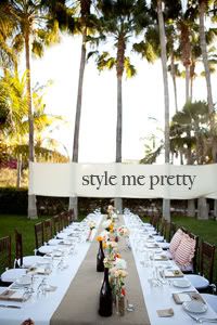
Today is a good day. A REALLY good day.
When I first started my event design & styling biz I only had dreams of one day making it to a feature on Style Me Pretty. Style Me Pretty is major. REALLY major. It’s the most popular wedding blog out there, dripping with only the most gorgeously detailed weddings imaginable. It’s the place where every wedding creative I’ve ever met dreams of having their work featured. And it was a BIG dream for me when I started this new business.
Vanessa & Tony’s wedding was quite simply amazing. Not only did I get to create a design and coordinate the day from start to finish, but I got to witness two of the most important people in my life commit their lives to one another. The entire wedding was one of those “out of the body” experiences and today feels much of the same. Today Vanessa & Tony’s wedding is being featured on Style Me Pretty and I could NOT be prouder.
I also am SO SO SO stinkin’ grateful for the photography brilliance of my dear friend Mo. Monica captured Vanessa & Tony’s wedding in the most genuine way…she really captured the beauty that is Vanessa & Tony and I’m so grateful for it!
Head over to SMP today and check out the feature here! Don’t forget to view the entire gallery here to get all the little details!
photo cred: {screen shot from style me pretty}
Event Design, Styling, Floral Concept + Coordination: {bow tie & bustle event design + styling} Wedding Photography: {Mo Hines Photography} Flowers: {Mazarte Florals} Calligraphy: Letters By Ellen / Venue, Catering + Make-up: Cabo Surf Hotel / Paper Goods + Invitations: bow tie & bustle event design + styling / Bride’s Hair: Mandi Rhodes / Wedding Dress: Jim Hjelm / Wedding Cake + Desserts: Cabo Surf Hotel
Filed under Bow Tie & Bustle, Bride & Groom, Bridesmaids, Brights, Business, Buttons, Cabo Surf Hotel, Cabo Wedding, Cakes, Centerpieces, Ceremony, Color Palette, Decor, Design, Dessert, Destination Wedding, Details, Escort Cards, Florals, Menu, Paper, Paper Suite, Prop Styling, Scout Vintage Rental Company, Seattle Event Design, Seattle Wedding Coordinator, Seattle Wedding Design, Seattle Wedding Designer, Seattle Wedding Planner, Style Me Pretty, Tabletop, Travel, Twine, Vintage Finds, Wedding Color Palette, Wedding Dress, Wedding Event, Weddings

photo cred: {justina blakeney of compai}
Filed under Florals, Home, Inspirations, Interiors, Pic Me a Palette

monday: college seemed liked a decade ago. oh wait. it practically was! i spent monday gazing nostalgically at my old campus. it’s amazing how many memories come rushing back when you spend a little time around your old stomping ground. made me realize how much i really miss my years in fort collins.

tuesday: adam and i celebrated year #2 today and we couldn’t be happier. the past 2 years have been some of the most rewarding and life altering thus far, and i could not have survived the many, MANY transitions without adam. so grateful for him. also was stoked to find some of our wedding pics while pinning…pleasant surprise!

wednesday: my sweet tooth has been off the charts this week! this donut cake (for real??!??!) doesn’t help.

thursday: as things start to wind down from the wedding season i’m beginning to evaluate how this 1st year of biz went. lots of things are swirling around in my mind…”how would i have done things differently?”….”what things need/must change?”….”what things went well?”…but mostly “am i doing what i really WANT to be doing?”. after leaving a nursing career to pursue a passion, i’m doing my very best to be honest with myself, and evaluate if my biz is where i really want it to be. more and more i feel this draw towards full event design/prop styling etc. and more and more florals keep poking at me. i love flowers and had the time of my life doing the full event design and florals at my sisters shower last saturday. contemplating whether florals should make more of a mainstay in my design efforts….LOTS to think about.

friday: coli is coming into town today!!!! yahoooooo! coli is my rad 19 year young lil’ sis and i’m so stoked to have her in town for a few days. i have a full weekend planned for us…beach…scouting…yummy eats…and DAVE! i’ve waited for 4 years to see dave matthews at the gorge and the time is finally here!!! dave. coli. sunday. gonna be bananas!
p.s. WEEK IN PINS UPDATE! last friday i was contemplating whether or not to go red or ombre…well…i went RED! still adjusting to the color shift and planning to share pics soon! happy weekend friends!
photo cred: m {sarah b. via flickr} t {becky young via style me pretty} w {sweet and saucy shop & gabriel ryan photographers via camille styles} th {zinnia floral designs} f {patrick smith}
Filed under Florals, Pinning, Pinterest, Weddings, Week In Pins
Vanessa and Tony are truly some of my most favorite people in the world. They are genuine; loving; witty as hell; crazy intelligent (they are both doctors in Peoria, IL – Vanessa in obstetrics and Tony in emergency medicine); they are both admirably athletic; and when they tell me they love me and care about the success of my business I REALLY believe them.
Their wedding is one I will FOREVER hold near and dear to my heart. For starters it officially marked my very 1st international destination wedding. 2nd I was given full design liberties which felt increadibly refreshing and exciting, and 3rd I was able to support my best friend in walking down the aisle to the love of her life.
So it should come at no surprise that my responsibility to plan and design their destination wedding in Cabo San Lucas, Mexico this past April came with just a wee bit of pressure as well…just a tad. I wanted their day to be perfect on all fronts…guests gettin’ down on the dance floor til the very last song; design elements that spoke to who they are as a couple and as individuals; a relaxing atmosphere full of fun in the sun; an overall crazy fun time and of course Vanessa and Tony grinning from ear to ear at the end of the night. Well I’m thrilled to say that all of my wishes came true!

Since Tony and Vanessa’s professions are a GIGANTIC part of their lives (we’re talking 100’s of hours a week at the hospital people!) and they met in medical school, I couldn’t resist incorporating multiple “medical” details into their day. I hung antique stethoscopes from their reception chairs, shredded an old medical book and placed the shreds in both their “message in a bottle” invitations, as well as in the base of the cake stand and on the reception table.
I incorporated an abundance of antique medicine bottles on their reception table adding florals to the vases the morning of the wedding. I accented the medicine bottles with flag bunting, buttons and twine. A 27 foot burlap runner ran across the entire length of the reception table providing an amazingly organic feel to the day. Each place setting was highlighted with a gorgeous calligraphied place card and wine cork (Vanessa loves wine), an individual menu tucked into a burlap colored napkin, and a teeny succulent on top.
Succulents were the one thing that were an absolute must for Vanessa and they were definitely the most beautiful floral detail of the day…just gorgeous!

Vanessa really liked the idea of getting married in a small intimate affair away from home and she and Tony couldn’t have done it in a better way! Cabo Surf Hotel was an absolutely amazing venue (staff, food, guest services…you name it – this resort has it going on!) and the destination wedding lends to a significantly relaxing experience for the bride and groom. There is WAYYYYY less pressure on the couple to entertain and mingle with 100’s of guests and I mean who doesn’t want to come home with a new husband AND a killer tan?!

I loved Tony and Vanessa’s guest book table which included square pieces of fabric for each guest to sign well wishes on. The pieces will be sewn together to create a lasting momento for the couple…love it!!!

Vanessa and Tony were super excited about the idea of having a dessert table and I’m so glad they did one! Whoopie pies, fruit tartlets, mini brownies, cheesecakes & key lime pies were the perfect addition to their tiny wedding cake. I accented the dessert table with hand marbled dessert card labels, more medicine bottles and antique platters & stands. Each mini dessert had a curly paper flag on top as a means of tying in the pretty color palette of the day. I added fabric flag bunting, a butterfly & a tiny mountain bike (Vanessa means “butterfly” and Tony is a crazy, mad talented mountain biker) to the cake itself. Butterfly accents were also included in the ribbon tied to the back of Vanessa’s chair.

Could she be any more beautiful?!??! Simple stunning.

The ceremony site was kept simple with an ivory satin covered canopy as the focal point, which was tied off on all 4 corners with burlap. The aisle was lined with various colored wine bottles and more curly paper details. The ocean was the most perfect backdrop! Stunning, stunning, stunning!


Tony and Vanessa, thank you so much for allowing me to play such a major role in crafting your wedding day. Thank you for trusting in me and for allowing me to create a day reminiscent of who you are. Thanks for a week full of laughter, love and friendship – I enjoyed every moment in Cabo with you! I wish you mountains of happiness and a lifetime of adventure together! Love you both!

event design, styling & coordination: {bow tie & bustle} venue: {cabo surf hotel} photographer: {mo hines photography} calligraphy: {letters by ellen} paper goods including invitations: {bow tie & bustle} floral design: {mazarte floral} bride’s hair: {mandi rhodes} floral concept & styling: {bow tie & bustle} bride’s dress: {jim hjelm}
Filed under Bow Tie & Bustle, Bride & Groom, Centerpieces, Ceremony, Decor, Design, Florals, Invitations, Paper, Personalized, Real Wedding, Reception, Travel, Weddings
For years I’ve been dropping hints to my husband (okay, rather sending obnoxious emails to his inbox with expressions of “ooooohhhhh yes, please!” or “ohhhhhh me likey!”) in relation to things I find on the web that I not only want, but clearly NEED.
This year I sent not 1, but 3 emails to Adam’s inbox asking to attend a floral workshop in Portland for my birthday. After pretending that he’d forgotten to buy me a spot into the workshop, and after me nearly losing it on him after realizing it was sold out, he surprised me! I was going to the workshop…yippeee!
I attended the workshop this past Saturday and was SO SO happy I did! The workshop was held at the gorgeous antique spot that is Bernadette Breu in downtown Portland, and in the midst of playing with some uber gorgeous spring flowers (sweet pea, freesia, lilac, hyacinth, bruneria, anemone, muscari, myrtle and ranunculus to be exact), I made some new friends and got the chance to meet Chelsea Fuss. Chelsea is the creative genius behind {frolic!} and her blog is totally adorable – you should check it out!
It was so awesome to learn some neat tips and tricks from Chelsea with regards to floral design. I had NO clue for example that I should clean my cutting shears and vases with a drop of bleach before using them, as to prevent the growth of bacteria which harms the flowers…crazy!
I also walked away with an adorable vintage chalkboard (a cutie that might just might find its way onto my “friday find” series this week), some big wooden spools, and a bright red lantern that screamed “take me home!”
Not a bad way to spend a Saturday…no sir-ree bob!


photo cred: 1, 2 {moi iPhone} 3 {chelsea fuss} 4, 5 {moi iPhone} 6 {chelsea fuss}
Filed under Florals, Just Because, Seasons

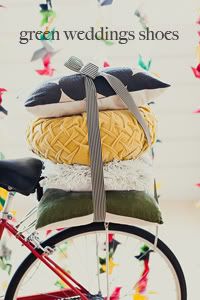
I am officially calling today: green thursday! Why?
bow tie & bustle and some of my favorite wedding peeps were featured today! Our Montmartre Inspiration Shoot made its way onto the front page of Green Wedding Shoes!!! Green Wedding Shoes is only one of the most spectacularly awesome and popular wedding blogs out there, and the amazing Jen Campbell featured our shoot today on her blog! I’m incredibly honored to have my very first styled shoot posted on her site, and I am so thankful for all the amazing friends and industry pros that assisted me in making it happen!

Photography: Monica and Seth of MoHinesPhotography
Floral Design: Teressa of Cashmere Floral Design
Desserts: Judy of Tallant House
Makeup: Cris of Glamour Cris
Hair: Brittany of Bartlett Bridal
Dress: Pricilla of Boston courtesy of Calla Bridal
Vintage Umbrellas: Bella Umbrella
Studio: Chalk Studios
Event Design, Styling and Coordination: me as in bow tie & bustle
Hair accessories, veil and paper goods: bow tie & bustle
Filed under Antiques, Bow Tie & Bustle, Brights, Buttons, Cakes, Color Obsessed, Decor, Dessert, Details, Envelope Liners, Fabric, Favors, Florals, Fun Fonts, Inspirations, Invitations, Paper, Paper Suite, Props, Reception, Styled Shoot, Themes, Travel, Vintage Finds, Weddings
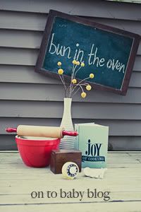
Exciting news today!!! The fabulously talented Monica from Mo Hines Photography and I collaborated a couple months back on a “Bun in the Oven” inspired maternity shoot and the photographs from the shoot and design concept are being featured today over on On To Baby! We had such a blast working with the adorable couple that is: Jenn & Ryan, and I am beyond excited and honored to see the shoot featured! Check it out!

Filed under Baby, Bow Tie & Bustle, Couples, Decor, Florals, Inspirations, Maternity, Styled Shoot, Vintage Finds
I’m over the moon excited to share the second batch of pictures (part one here) from the Montmartre inspiration shoot. These pics were shot by MoHinesPhotography and include some of my most favorite shots from the day, including the dessert table full of the most incredibly enticing French pastries one could wish for, and a vibrantly colorful graffiti wall – cause nothing says Montmartre like a little graffiti!
Thanks again to all of the amazing people who made this shoot possible! A total dream come true!


When I was dreaming up this shoot in Paris, THIS is exactly what I saw! So in LOVE! Gives me chills!


Another fab bouquet by Teressa. Stunning!

Too cute!


Gretchen is so fierce in this one!

If I had to choose a single pic from the shoot, the one above would be it. I’m obsessed!

The birdcage veil was made with netting I bought in Montmartre. I sewed together my most favorite vintage buttons to create the hairpiece.

I begged Mo to get one shot of just the wall for me…she didn’t disappoint. Thanks Mo!

Some of histories best known artists (Van Gogh, Renoir, Degas, Picasso) painted and lived in Montmartre during their day, and even now this amazing area of Paris bursts at seams with resounding art influence – putting art at the heart of my design. I wanted to make sure to pay tribute to Place du Tertre (a square beneath the watchful eye of the Basilique du Sacre Coeur) where artists set up their easels, canvases and umbrellas daily with the hopes of selling one of their masterpieces. Teressa suggested that we use the canvas as a guest book so I painted it with splashes of paint the night before and we all made our mark at the shoot : )


I used a distressed drop lead table, this adorable antique mirror and a rusty mailbox to create a “well wishes” table. The word “cartes” means letters in French. Each postcard had a different french poster on the front with many of them focusing on the infamous Moulin Rouge.


French bistro chairs…so in love with these gems.

The reception table was created using a distressed white picnic table, a picnic bench and adorable french bistro chairs I borrowed from a local cafe named Odd Fellows (if you’ve never been there…check it out…very yummy!). I used textured pillows in various patterns to give the table setting some depth and hung a yellow chandelier I found vintage over the top of the table.


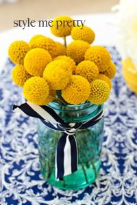
Bonne Maman jelly is something you cannot miss in France. It’s everywhere. I used it here as a favor, tying a chalkboard tag around each jar with burlap. Chalkboard detailing was included in many aspects of the shoot, including the dessert table banner, various signage and the paper goods, since this form of marketing is used all over Paris in the floral and food markets. Teressa filled the table with pops of yellow, red and green flowers including ranunculus and parrot tulips. No two pieces of silverware on the table were alike giving the table an eclectic and whimsical touch. I couldn’t imagine the setting without a cup and saucer as cafe au lait and chocolate chaud are dining staples for Parisians. The black and white polkadot napkins were made with fabric I’d found at a local craft store and the setting was finished off with adorable red ranunculus by Teressa.

I used fabric and twine to create bunting across the wedding cake. This cake created by Judy Tallant of Tallant House is called “ruffled panties” – love it!

I used a vintage green hutch to create a dessert “table” which was layered with the most mouth-watering French pastries one could imagine and mini jars of French jelly to complement the almond croissants. The hutch was decorated with varying shades of fringed patterned fabric, more paper pinwheels, and a “bon appetite” banner. Judy from Tallant House masterfully created eclairs, french macaroons, tiny palimiers, teeny tarlets and the some of the most fantastic almond croissants I’ve ever tasted. I included mini Bonne Maman jellies on the table to complement the croissants. A wood window frame was used above the table with red ranunculus to create the effect of a french balcony.


I created the dessert stands by gluing antique silver platters to the bottom of glass drinking glasses. I then place the glasses over a pile of colorful buttons, labeling them with a chalk font.


The save the date listed out all the available pastries along with the phrase “Adore pasteries? Adore us? See you in Paris.”


I handcrafted the paper suite using red paper doilies as envelope liners, a red button and twine. I placed the words “I love you” in multiple languages in red, yellow, green and black across the top and bottom of the invitation, reply card and thank you note as a means to represent the “Love Wall” in Montmartre. I used a font that reminded me of chalk as a means to tie in the other chalkboard details throughout the design.


Event Design, Styling and Coordination: bow tie & bustle | Photography: MoHinesPhotography | Floral Design: Cashmere Floral Design | Desserts: Tallant House | Makeup: Glamour Cris | Hair: Bartlett Bridal | Dress: Pricilla of Boston courtesy of Calla Bridal | Vintage Umbrellas: Bella Umbrella | Studio: Chalk Studios | Hair accessories and veil: bow tie & bustle | Paper Goods: bow tie & bustle
Filed under Antiques, Bow Tie & Bustle, Brights, Buttons, Cakes, Decor, Dessert, Envelope Liners, Fabric, Favors, Florals, Graffiti, Inspirations, Invitations, Liners, Paper, Paper Suite, Props, Reception, Styled Shoot, Themes, Travel, Twine, Vintage Finds, Weddings


