Category Archives: Invitations

inspired by : typography.

It doesn’t matter whether it’s a birthday party, wedding, baby shower or dinner party – you’ve gotta somehow get your guests there. 1st step? Invitations.

One of the best parts of creating pretty paper details is finding the right type. Font is such a huge aspect of invitations and finding the right fit can at times be the most challenging part. The type can really set the tone for the entire shindig.

photo cred :  1 {baster} 2 3 5 6 {steve buffoni} 4 {behance} 6 {typography served} 7 {unknown}

6 Comments

Filed under Antique Rentals Seattle, Bow Tie & Bustle, Design, Graphic Design, Graphics, Inspirations, Invitations, Paper, Scout Vintage Rental Company, Scout Vintage Rentals, Scout., Seattle Prop Rentals, Seattle Vintage Rentals

twelve baskets open house!

January is sure to be a BIG month! I’m already getting geared up for the upcoming open house for Twelve Baskets Catering next month! Food has to be one of my favorite details at any party so I’m super excited to see what Twelve Basket’s has in store!

I’ll be providing a bunch of my vintage goodies from scout. for the evening and will have my own little area of the room. I would love for you to drop by and say hi! There will be a bunch of other fabulous vendors there including entertainment and of course…grub!

Check out all the details here, and don’t forget to RSVP ASAP! Spots are limited and will surely fill up quick! Hope to see you there!

1 Comment

Filed under Bride & Groom, Couples, Invitations, Local Happenings, Open House, Party, Prop Rentals, Prop Styling, Props, Reception, Scout Vintage Rental Company, Scout Vintage Rentals, Scout., Seattle Prop Rentals, Seattle Vintage Rentals, Wedding Event, Weddings

inspired board # 7 : around the world.

photo cred: {map bunting via etsy} {wall mural via urban outfitters} {jo metson globe interiors via design sponge} {invitation suite by nothing but bonfires} {map pinwheels via etsy} {map wrapped favors via martha stewart weddings} {escort card display by enjoy events co.} {love globe via forget me knot weddings} {teak globe via hilda grahmat}

4 Comments

Filed under Antiques, Bow Tie & Bustle, Centerpieces, Decor, Decorating, Design, Details, DIY, Globe, Home, Inspiration Board, Inspirations, Inspired Board, Interiors, Invitations, Maps, Paper, Paper Suite, Parties, Props, Themes, Travel, Weddings

defined: invitation.

in·vi·ta·tion/ˌinviˈtāSHən

noun. a written or verbal request inviting someone to go somewhere or to do something OR the best way to give your guests a sneak peek into the fabulousness of your event or wedding and get them super duper excited.

photo cred: {popsicle invites via martha stewart}

1 Comment

Filed under Defined, Invitations

real wedding: vanessa + tony in cabo san lucas.

Vanessa and Tony are truly some of my most favorite people in the world. They are genuine; loving; witty as hell; crazy intelligent (they are both doctors in Peoria, IL – Vanessa in obstetrics and Tony in emergency medicine); they are both admirably athletic; and when they tell me they love me and care about the success of my business I REALLY believe them.

Their wedding is one I will FOREVER hold near and dear to my heart. For starters it officially marked my very 1st international destination wedding. 2nd I was given full design liberties which felt increadibly refreshing and exciting, and 3rd I was able to support my best friend in walking down the aisle to the love of her life.

So it should come at no surprise that my responsibility to plan and design their destination wedding in Cabo San Lucas, Mexico this past April came with just a wee bit of pressure as well…just a tad. I wanted their day to be perfect on all fronts…guests gettin’ down on the dance floor til the very last song; design elements that spoke to who they are as a couple and as individuals; a relaxing atmosphere full of fun in the sun; an overall crazy fun time and of course Vanessa and Tony grinning from ear to ear at the end of the night. Well I’m thrilled to say that all of my wishes came true!

Since Tony and Vanessa’s professions are a GIGANTIC part of their lives (we’re talking 100’s of hours a week at the hospital people!) and they met in medical school, I couldn’t resist incorporating multiple “medical” details into their day. I hung antique stethoscopes from their reception chairs, shredded an old medical book and placed the shreds in both their “message in a bottle” invitations, as well as in the base of the cake stand and on the reception table.

I incorporated an abundance of antique medicine bottles on their reception table adding florals to the vases the morning of the wedding. I accented the medicine bottles with flag bunting, buttons and twine. A 27 foot burlap runner ran across the entire length of the reception table providing an amazingly organic feel to the day. Each place setting was highlighted with a gorgeous calligraphied place card and wine cork (Vanessa loves wine), an individual menu tucked into a burlap colored napkin, and a teeny succulent on top.

Succulents were the one thing that were an absolute must for Vanessa and they were definitely the most beautiful floral detail of the day…just gorgeous!

Vanessa really liked the idea of getting married in a small intimate affair away from home and she and Tony couldn’t have done it in a better way! Cabo Surf Hotel was an absolutely amazing venue (staff, food, guest services…you name it – this resort has it going on!) and the destination wedding lends to a significantly relaxing experience for the bride and groom. There is WAYYYYY less pressure on the couple to entertain and mingle with 100’s of guests and I mean who doesn’t want to come home with a new husband AND a killer tan?!

I loved Tony and Vanessa’s guest book table which included square pieces of fabric for each guest to sign well wishes on. The pieces will be sewn together to create a lasting momento for the couple…love it!!!

Vanessa and Tony were super excited about the idea of having a dessert table and I’m so glad they did one! Whoopie pies, fruit tartlets, mini brownies, cheesecakes & key lime pies were the perfect addition to their tiny wedding cake. I accented the dessert table with hand marbled dessert card labels, more medicine bottles and antique platters & stands. Each mini dessert had a curly paper flag on top as a means of tying in the pretty color palette of the day. I added fabric flag bunting, a butterfly & a tiny mountain bike (Vanessa means “butterfly” and Tony is a crazy, mad talented mountain biker) to the cake itself. Butterfly accents were also included in the ribbon tied to the back of Vanessa’s chair.

Could she be any more beautiful?!??! Simple stunning.

The ceremony site was kept simple with an ivory satin covered canopy as the focal point, which was tied off on all 4 corners with burlap. The aisle was lined with various colored wine bottles and more curly paper details. The ocean was the most perfect backdrop! Stunning, stunning, stunning!

Tony and Vanessa, thank you so much for allowing me to play such a major role in crafting your wedding day. Thank you for trusting in me and for allowing me to create a day reminiscent of who you are. Thanks for a week full of laughter, love and friendship – I enjoyed every moment in Cabo with you! I wish you mountains of happiness and a lifetime of adventure together! Love you both!

event design, styling & coordination: {bow tie & bustle} venue: {cabo surf hotel} photographer: {mo hines photography} calligraphy: {letters by ellen} paper goods including invitations: {bow tie & bustle} floral design: {mazarte floral} bride’s hair: {mandi rhodes} floral concept & styling: {bow tie & bustle} bride’s dress: {jim hjelm}

1 Comment

Filed under Bow Tie & Bustle, Bride & Groom, Centerpieces, Ceremony, Decor, Design, Florals, Invitations, Paper, Personalized, Real Wedding, Reception, Travel, Weddings

tony + vanessa sneak peek!

8 days and counting until Tony and Vanessa’s big day in Mexico!

Beach + sunshine + one incredibly adorable couple…what could be better?

Here’s a little sneak peek of their wedding invitation…

I used a neutral color palette and a champagne bottle with cork topper to create a “message in a bottle” invitation to compliment their beach wedding location: Cabo San Lucas. I placed shredded pieces of a vintage Grey’s Anatomy medical book into the bottom of the bottle, as Vanessa and Tony are both doctors, and met each other in medical school.

I hand marbled watercolor paper in their wedding colors (orange and green), then cut the marbled paper to create a closure for their invitation scroll. I made sure to add a timeline of events to their invitation to get their guests excited about what was to come. I finished off the bottle with the letter “c” as in: c is for cameron and c is for cabo.

I can’t wait for this wedding! Congrats V + T!

photo credits: 1 + 2 {MoHinesPhotography}

1 Comment

Filed under Details, Invitations, Weddings

green wedding shoes feature!

I am officially calling today: green thursday! Why?

bow tie & bustle and some of my favorite wedding peeps were featured today! Our Montmartre Inspiration Shoot made its way onto the front page of Green Wedding Shoes!!! Green Wedding Shoes is only one of the most spectacularly awesome and popular wedding blogs out there, and the amazing Jen Campbell featured our shoot today on her blog! I’m incredibly honored to have my very first styled shoot posted on her site, and I am so thankful for all the amazing friends and industry pros that assisted me in making it happen!

Photography: Monica and Seth of MoHinesPhotography

Floral Design: Teressa of Cashmere Floral Design

Desserts: Judy of Tallant House

Makeup: Cris of Glamour Cris

Hair: Brittany of Bartlett Bridal

Dress: Pricilla of Boston courtesy of Calla Bridal

Vintage Umbrellas: Bella Umbrella

Studio: Chalk Studios

Event Design, Styling and Coordination: me as in bow tie & bustle

Hair accessories, veil and paper goods: bow tie & bustle


3 Comments

Filed under Antiques, Bow Tie & Bustle, Brights, Buttons, Cakes, Color Obsessed, Decor, Dessert, Details, Envelope Liners, Fabric, Favors, Florals, Fun Fonts, Inspirations, Invitations, Paper, Paper Suite, Props, Reception, Styled Shoot, Themes, Travel, Vintage Finds, Weddings

montmartre inspiration shoot: part deux.

I’m over the moon excited to share the second batch of pictures (part one here) from the Montmartre inspiration shoot. These pics were shot by MoHinesPhotography and include some of my most favorite shots from the day, including the dessert table full of the most incredibly enticing French pastries one could wish for, and a vibrantly colorful graffiti wall – cause nothing says Montmartre like a little graffiti!

Thanks again to all of the amazing people who made this shoot possible! A total dream come true!

When I was dreaming up this shoot in Paris, THIS is exactly what I saw! So in LOVE! Gives me chills!

Another fab bouquet by Teressa. Stunning!

Too cute!

Gretchen is so fierce in this one!

If I had to choose a single pic from the shoot, the one above would be it. I’m obsessed!

The birdcage veil was made with netting I bought in Montmartre. I sewed together my most favorite vintage buttons to create the hairpiece.

I begged Mo to get one shot of just the wall for me…she didn’t disappoint. Thanks Mo!

Some of histories best known artists (Van Gogh, Renoir, Degas, Picasso) painted and lived in Montmartre during their day, and even now this amazing area of Paris bursts at seams with resounding art influence – putting art at the heart of my design. I wanted to make sure to pay tribute to Place du Tertre (a square beneath the watchful eye of the Basilique du Sacre Coeur) where artists set up their easels, canvases and umbrellas daily with the hopes of selling one of their masterpieces. Teressa suggested that we use the canvas as a guest book so I painted it with splashes of paint the night before and we all made our mark at the shoot : )

I used a distressed drop lead table, this adorable antique mirror and a rusty mailbox to create a “well wishes” table. The word “cartes” means letters in French. Each postcard had a different french poster on the front with many of them focusing on the infamous Moulin Rouge.

French bistro chairs…so in love with these gems.

The reception table was created using a distressed white picnic table, a picnic bench and adorable french bistro chairs I borrowed from a local cafe named Odd Fellows (if you’ve never been there…check it out…very yummy!). I used textured pillows in various patterns to give the table setting some depth and hung a yellow chandelier I found vintage over the top of the table.

Bonne Maman jelly is something you cannot miss in France. It’s everywhere. I used it here as a favor, tying a chalkboard tag around each jar with burlap. Chalkboard detailing was included in many aspects of the shoot, including the dessert table banner, various signage and the paper goods, since this form of marketing is used all over Paris in the floral and food markets. Teressa filled the table with pops of yellow, red and green flowers including ranunculus and parrot tulips. No two pieces of silverware on the table were alike giving the table an eclectic and whimsical touch. I couldn’t imagine the setting without a cup and saucer as cafe au lait and chocolate chaud are dining staples for Parisians. The black and white polkadot napkins were made with fabric I’d found at a local craft store and the setting was finished off with adorable red ranunculus by Teressa.

I used fabric and twine to create bunting across the wedding cake. This cake created by Judy Tallant of Tallant House is called “ruffled panties” – love it!

I used a vintage green hutch to create a dessert “table” which was layered with the most mouth-watering French pastries one could imagine and mini jars of French jelly to complement the almond croissants. The hutch was decorated with varying shades of fringed patterned fabric, more paper pinwheels, and a “bon appetite” banner. Judy from Tallant House masterfully created eclairs, french macaroons, tiny palimiers, teeny tarlets and the some of the most fantastic almond croissants I’ve ever tasted. I included mini Bonne Maman jellies on the table to complement the croissants. A wood window frame was used above the table with red ranunculus to create the effect of a french balcony.

I created the dessert stands by gluing antique silver platters to the bottom of glass drinking glasses. I then place the glasses over a pile of colorful buttons, labeling them with a chalk font.

The save the date listed out all the available pastries along with the phrase “Adore pasteries? Adore us? See you in Paris.”

I handcrafted the paper suite using red paper doilies as envelope liners, a red button and twine. I placed the words “I love you” in multiple languages in red, yellow, green and black across the top and bottom of the invitation, reply card and thank you note as a means to represent the “Love Wall” in Montmartre. I used a font that reminded me of chalk as a means to tie in the other chalkboard details throughout the design.

Event Design, Styling and Coordination: bow tie & bustle | Photography: MoHinesPhotography | Floral Design: Cashmere Floral Design | Desserts: Tallant House | Makeup: Glamour Cris | Hair: Bartlett Bridal | Dress: Pricilla of Boston courtesy of Calla Bridal | Vintage Umbrellas: Bella Umbrella | Studio: Chalk Studios | Hair accessories and veil: bow tie & bustle | Paper Goods: bow tie & bustle

11 Comments

Filed under Antiques, Bow Tie & Bustle, Brights, Buttons, Cakes, Decor, Dessert, Envelope Liners, Fabric, Favors, Florals, Graffiti, Inspirations, Invitations, Liners, Paper, Paper Suite, Props, Reception, Styled Shoot, Themes, Travel, Twine, Vintage Finds, Weddings

montmartre inspiration shoot: part un.

I’ve never felt more alive than I did when I was in Montmartre. Montmartre is about a 20 minute metro ride outside the center of Paris and is an area of the city that has this raw, dark, whimsical edge to it that just makes my heart sing. It may be the monstrous hills that make you question your choice of attire for the day; or the Basilique du Sacre Coeur which entices you to gaze up towards the heavens; or the graffiti soaked rooftops and store fronts that bring a certain juxtaposition and mystery to the all the gray; or the big red windmill that stands proudly above the Moulin Rouge almost forcefully enticing you to catch a glimpse of the most famous cabaret of all; or Place du Tertre which is overrun with artists and portraitures alike; or the rows and rows of cafe chairs that when occupied make you feel like you’re surrounded by friends and loved ones. It would be near impossible for me to pinpoint just one thing that’s most spectacular about Montmartre…put simply: it’s all fabulous, it’s all Parisian and it’s all inspiring!

For the past 5 months I have spent an immense amount of time looking inward and asking myself where my passions lie and what types of things truly fill my soul. One thing I’ve realized most is that details (and I mean every detail, down to chipped paint and busted door locks) make me truly happy – and I’m talking pure genuine, butterfly in your stomach, smiling to the point of exhaustion happy. And over the past five months I’ve realized that there was this intense need/desire/burning sense of urgency within me to create a styled inspiration shoot paying tribute to my favorite place in the world, while also celebrating all of the little details that make life fabulous!

Many of my intentions as a wedding designer and coordinator is to encourage other’s to see the beauty in life’s details and to encourage brides and grooms to intertwine these details into their wedding day. I encourage them to pinpoint the things that feed their own souls, that reflect their own personalities and relationship and to make these things known and present on their big day.

I’m absolutely giddy to finally be sharing the neverending stream of details of the design with you…can you say: french macaroons, vintage umbrellas, a big black tulle bow, antique green gloves, a red bike, a pinwheel backdrop, vintage furniture, chalk, miniature bonne maman jellies, buttons, stunning flowers, dominos, a tree-branch umbrella, mouth-watering pastries, graffiti, a yellow chandelier, and red lips?!

Along with the support of some amazing wedding creatives my little slice of Montmartre came to life, and I couldn’t be prouder! But before I let the oogling begin, I wanted to take a moment to say thank you to: Monica, Teressa, Cris, Brittany, Judy, Jodell, Yachi, Gretchen, Seth, Adam and Erik – this shoot would not have come to fruition with out your amazing contributions and talent!

Oh and these photographs….compliments of the AMAZING duo of Monica and Seth Hines – you two are beyond.

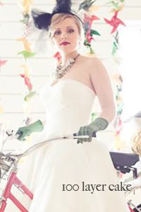
My stunningly beautiful friend Gretchen. She was the absolute best person to be our model for the day as she is achingly gorgeous and was just a bride herself this past fall! Also, what is a Parisian photo shoot without a little Eiffel Tower??!

Gretchen’s makeup was flawless. Cris did such an amazing job giving Gretchen those fantastic bright red lips!

We were privileged with the most amazing lighting in Chalk Studios.

Red, green, yellow and black instantly took front stage in the design, as these colors are key players in this area of Paris. I handcrafted this paper pinwheel backdrop using brightly colored and patterned card stock…my fingers were sore for days, but it was SOOOO worth it – I loved how it turned out. The pinwheel concept was meant to pay tribute to the many beautiful windmills throughout the hills of Montmartre.

Brittany of Bartlett Bridal did an amazing job on Gretchen’s hair creating a low messy bun with just the right amount of loose pieces….so adorable!

A french shutter was an absolute MUST. And isn’t that bouquet to DIE for! Teressa from Cashmere Floral Design has some serious talent!

I’m soooo in love with this distressed turquoise green french bistro chair I found in the rain in a “junk” yard. It reminded me of all the exquisitely distressed chairs in Paris.

One of my favorite shots of the day.

Calla Bridal generously loaned this adorable Priscilla of Boston gown which I chose because the silhouette reminded me of the many carousels throughout Montmartre. I added a petticoat underneath to give it even more flair.

The black bow! OOOHHHH! I couldn’t imagine this shoot without a humongous bow on top of Gretchen’s head. I used black tulle to create a “headband” sort of piece with the tulle singing loud and proud atop her head. I wanna wear this thing around town!

Nothing says “french” more to me than a gigantic baguette! The adorable wicker basket is actually a purchase from Paris.

AND the umbrellas. Aren’t they just fantastic?!! All the umbrellas are vintage and were provided by Bella Umbrella in Seattle. I wanted to incorporate the umbrellas because they reminded me of the intricately decorated carousels in Montmartre. I’m so head over heels for the yellow one above!

This “umbrella” on the other hand was a fantastic piece found by Erik who owns Chalk Studios where the shoot took place. Us Seattleites couldn’t imagine not using it in the shoot….so cool!

I was so excited about these green gloves. I found them at an antique store and just had to incorporate them. The number 13 in dominos represents the “wedding day” which took place on February 13th.

Judy from Tallant House was able to craft the most adorable French macaroons…yummy!

There was no way I could design a Parisian shoot without incorporating a bicycle! This one an old vintage Schwinn that I had painted red.

Make sure to check back tomorrow for the rest of the details including a graffiti wall, desserts and more!

Event Design, Styling and Coordination: bow tie & bustle | Photography: MoHinesPhotography | Floral Design: Cashmere Floral Design | Desserts: Tallant House | Makeup: Glamour Cris | Hair: Bartlett Bridal | Dress: Pricilla of Boston courtesy of Calla Bridal | Vintage Umbrellas: Bella Umbrella | Studio: Chalk Studios | Hair accessories and veil: bow tie & bustle | Paper Goods: bow tie & bustle

10 Comments

Filed under Antiques, Bow Tie & Bustle, Brights, Buttons, Cakes, Decor, Dessert, Envelope Liners, Fabric, Favors, Florals, Fun Fonts, Gift Tags, Graffiti, Inspirations, Invitations, Lighting, Liners, Paper Suite, Props, Reception, Styled Shoot, Themes, Travel, Twine, Vintage Finds, Weddings

bow tie & bustle

It’s official! bow tie & bustle is here! Yep! After months and months, and weeks and weeks of working on this new business, my website is officially launched! Check it out at: www.bowtieandbustle.com. Bow Tie & Bustle is an event design and coordination business in Seattle, WA with a focus on the unique details that make us who we are. My time in Europe reminded me of how much I love the little details in life and this business is a clear reflection of that love. My hope is to continue incorporating my love for paper as well, so if you know anyone who is in need of a unique design or decor styling for a wedding, photo shoot, party or paper product, keep me in mind : )

There is still much more to be done: a new blog (coming soon!), a networking and inspiration blog for brides/grooms and vendors alike with a focus on the Pacific Northwest, an upcoming Parisian inspired (who could forget about Paris!) photo shoot with my dear friend and photographer Monica Hines and much, much more! I can’t wait to share all the details of the new biz, and am so excited and thrilled to be following my heart AND my gut! I can’t wait to see what the future holds for Bow Tie & Bustle!

Thanks to all who have supported me in getting here. I couldn’t have done this without the love, hugs, listening ears, and word of mouth that so many of you have kindly offered! Thank you! Thank you!

For now, a sneak peak at the “Bun in the Oven” photo shoot I was involved in a couple weeks ago…thanks to MoHinesPhotography for the amazing photographs!


Me setting up the shoot at one of the most adorable couple’s home. Thanks to Jenn and Ryan Strom for allowing me to be involved in their baby bump shoot!

The entire design for the shoot came from an idea that literally made me jump out of bed one morning…bun in the oven…a vintage timer…baby bump…oooooh! Look for an upcoming blog post on this adorable photo shoot!

4 Comments

Filed under Baby, Birthday, Bow Tie & Bustle, Business, Engagements, Greeting Cards, Inspirations, Invitations, Parties, Personalized, Self Exploration, Themes, Weddings

50 and Fabulous

A couple of months ago, I received an inquiry from one of my sister’s closest friends, Dani. Dani is absolutely adorable. She has one of the biggest grins I have ever seen, and she is amazingly sweet and kind to my sister (a BIG plus from a sister’s point of view)! I got to know Dani a whole lot better when we were both bridesmaids in my sister Sarah’s wedding this past August, and was tickled to get the opportunity to create a paper design with her.

Like Dani, her mom is this beautiful woman that just exudes radiance, and appears to have an energy that people gravitate towards. I’ve only had the opportunity to meet Dani’s mom once, but I knew the moment I met her that she is one extremely special woman. So, it was an utter surprise, and total thrill for me, when Dani sent me an email asking me to help her create a birthday invitation for her Mom’s 50th surprise birthday party this October.

I asked Dani to share a few things with me about her mom: “My mom is extremely outgoing, vivacious and the life of the party. Everyone wants to be her best friend, you can’ t help but love her. She has the biggest heart of anyone I know and loves making the people she loves feel special“…she went on to state that her mom loved earth tones, and that she wanted the invitation to have a “50 and Fabulous” type theme.

It only took me a split second to find the perfect decorative paper that completely inspired my design. Just like Dani’s mom, this paper was something I instantly gravitated towards the second I entered the store, and one I couldn’t help but love. This exquisite Italian paper is laced with varying shades of gold, orange, green, yellow and bits of blue; it is stunning. I bought every ounce of the paper from the store, and rushed home to begin the design. Coral was chosen as the primary color of the invitation, because it just seemed to be the perfect compliment to Dani’s mom’s personality.

Dani, thanks for giving me the opportunity to be included in such a special celebration for your Mom. I hope the surprise party goes splendidly!

Leave a comment

Filed under Birthday, Brights, Envelope Liners, Fun Fonts, Graphics, Inspirations, Invitations, Parties, Personalized, Themes, Unique Paper Prints

A Shower of Love

Over the past several months I have been extremely excited for my good friend, Emma, and her fiance, Jason, to get married. Emma and Jason are quickly becoming some of mine and Adam’s closest friends in Seattle. Finding a great friend is tough enough, but finding a great couple that you AND your spouse have things in common with, AND enjoy hanging out with is hard to find.

I have worked with Emma for quite some time now, and her spunky east coast personality, and HUGE heart make her such an amazing person to be around. I am going to miss her terribly in September when I am no longer with Becoming Parents, but I know that Emma and I will remain close friends for many, many years to come.

Emma and Jason are getting married on September 18th in upstate New York, and I wanted to throw Emma a bridal shower with her closest girlfriends before her big day. I set a plan to decorate her shower with bright girly colors, and decided to use canary yellow, gray, purple, red and hot pink as the primary colors for both the party and her shower invitations.

For the past several months, I have been wanting to use these tiny heart buttons I found, and I thought that Emma’s shower invitation just might be the perfect way to incorporate them into my designs. I stamped an umbrella onto white cardstock, embossed it, and then hand stitched the heart buttons to represent raindrops. I wanted the umbrella and “raindrops” to not only represent a “shower of love” for Emma, but to also symbolize Emma’s life with Jason in Seattle.

Check em’ out! And Happy Bridal Shower Em!

2 Comments

Filed under Buttons, Envelope Liners, Fun Fonts, Invitations, Parties, Stamps

Wanna Get Away?

Travel is something I live for. Really, I don’t know who I am without at least 1-3 trips on my “to do” list. It’s to the point that I can’t see one of my Seattle buddies without them saying “Adam just sent me a text for poker night. Where you headed to now?” I get a ton of grief about my constant traveling, but I know it’s something that feeds my soul, and luckily I have a spouse who understands my travel obsession, and supports me in any new endeavor or adventure I set my sights on.

I vividly remember my final train ride on my European honeymoon, and bawling my eyes out because for the first time in 4 years I didn’t have a single trip on the horizon. I quickly got home and planned a trip to Cabo San Lucas with some of my closest girlfriends, because I honestly didn’t feel like myself without my travel bug at bay.

I’ve never quite understood where my infatuation with travel comes from, but can always remember being extremely jealous of friends who would travel to far off lands. Every time I come within yards of an airport I feel a rush of excitement and yearning to hop on the next available plane to…well…anywhere!

Over the past several years I have been afforded AMAZING opportunities to visit family, vacation with close friends, and now to take a personal trip to Europe. A lot of this comes from setting traveling as my ultimate priority, but also from a career in nursing which allows for extended time off and a continued aching desire to increase my cultural competencies.

As I prep for my upcoming solo trip to Europe (a trip I’ve been waiting my WHOLE life for) I contemplate the endless amounts of places to visit and ponder the reality of traveling alone….eeeks! My honeymoon a year ago fueled my desire to see more of the world, and with an imminent layoff from a job I love at the end of September, what better time to pack it all up and jet set for 6 weeks or so, right?

With plans to spend about 4 weeks of my trip alone in Paris (blogging, cafe-ing, walking, sleeping, eating, antiquing, pondering, biking, discovering, and anything else with an “ing”), I also know that I want to spend about 2 weeks or so, hitting up the trains, and visiting various countries around France.

Now, despite what my friends and family might say, being alone is not something I necessarily fear, but actually something I quite enjoy from time to time. I am totally stoked for a few weeks to myself to figure out the “next step” in my life, whether that be continuing on my nursing career path, or braving some new adventures. With that said, I wouldn’t mind spending a couple weeks or so with good friends traveling from place to place expanding my view of the world.

As a means of inquiring about who might be available to take a leave from work, or school, or motherhood, or residency (hi V!) to travel with me, I created a little greeting card for a few of my closest girlfriends. I thought it would be fun to send a card rather than an email, text or phone call, to ask if anyone was interested in spending a couple of weeks or so away from home.

I found this AMAZING map of Paris and cut it to pieces to create both an envelope liner, and various parts of the card itself. I used vibrant turquoise colors to accent the look of the card, an amazingly funky font, and finished the design off with a tiny Eiffel Tower charm tucked in the envelope.

With hopes to get a “heck yes!” response from at least one of my gal pals, I sealed the envelopes and sent them on their way. Now just one step closer to the trip of lifetime…

1 Comment

Filed under Brights, Charms, Envelope Liners, Fun Fonts, Greeting Cards, Invitations, Just Because, Themes, Travel, Unique Paper Prints

The Bachelorette

I’m sure I’ve mentioned it more than once on this blog, but I love my sister Sarah. I really do. And she is getting MARRIED! Soon! And of course as the wedding approaches, the festivities to celebrate the bride are quickly approaching as well!

In July, I get the opportunity to host my sister’s bachelorette party back home in Denver. Now, when I initially took on this task I thought, “oh no, the old chick is planning the party” and had no doubt in my mind that I wouldn’t have a clue where to start. But after some deep contemplation, I realized that “hey! I once used to be ‘cool,’ and have made a few rounds in Denver myself!”

After some “googling,” I set a plan for the party and got squared away on the invitation design to hopefully spark some excitement for the guests and for Sarah.

I wanted to keep most of the party a secret from Sarah, so I kept the details of the invitation pretty vague, but gave the guests an idea of location, time, pertinent lingerie sizing, and the basic agenda of the evening. I decided to use 3 different colors of paper to not only follow Sarah’s wedding colors and theme, but also to make the invitation a bit unique for the bachelorette party itself.

I used bright red brads to hold the invitation together and completed the “show some love” invite by hand stitching a heart on top of the invitation using red thread. I have ALWAYS loved the concept of incorporating unexpected items into my paper designs and was so excited when I found this turquoise, green, red and yellow striped fabric from a funky vintage fabric store in downtown Seattle. I finished off the hearts by distressing the edges to give them that worn, vintage look to complement Sarah’s 50’s wedding theme.

I completed the design by tucking the invitations in a string tie envelope and continuing the colors of red and turquoise on the address labels using colorful cardstock.

I CANNOT wait to head home in a few weeks to really get the celebration started with the bride and her friends and family!

Leave a comment

Filed under Envelopes, Fabric, Invitations, Parties, Personalized

That First Glimpse

I’d been itching for the opportunity to create another wedding invitation design since I finished mine and Adam’s wedding invites last year. Wedding invitations are probably one of my most favorite paper projects, because in my opinion, the wedding invitation is UBER important. The wedding invitation is often the very first glimpse your guests get of the overall “feel” of your wedding, and they can be that extra special touch that gives your guests an idea of what is to come. I love when wedding invitations are included as one of the details that set the whole stage for the overall theme of the wedding.

So, it was no surprise that I was OVER THE MOON earlier this year when my sister Sarah got engaged AND said that she would allow me to design her wedding invitations! I couldn’t wait for the opportunity to create an invitation that was spunky, upbeat, and colorful (just like Sarah) and represented the style and theme of her upcoming wedding.

Sarah decided a few months ago that she and Tristan would use the colors red and turquoise as their primary wedding colors and would also incorporate a “50’s Diner Theme” into their wedding details. I was so excited to hear about their plan because I knew the theme afforded me the opportunity to do something REALLY fun. Now, don’t get me wrong, I do love the look of a traditional wedding invitation, but I also LOVE exploring ways to create wedding invitations that represent the overall theme and look of the wedding and get the guests really excited about what is to come….which I have to say often includes extremely bright colors and funky papers – two things that have not traditionally coincided with a wedding invite.

Here are a few pics of the invitation I created for Sarah and Tristan’s wedding this August. I ended up using two different kinds of decorative paper to give the invitations their own little personality. I can’t wait for Sarah and Tristan’s big day and I hope their guests enjoy this “first glimpse” into the theme of their big day! Congratulations you two!

Leave a comment

Filed under Inspirations, Invitations, Weddings